
Deplo keeps one live metrics stream open to each server's agent, for the whole machine and every container on it. The last 16 minutes are kept in memory.
Charts are full the moment a page opens, and per-app monitoring has no switch to turn on.
A server with an old agent falls back to polling, and the whole fleet can be
forced onto polling with DEPLO_MONITORING_FORCE_POLL=1. Everything on this
page works either way, with fewer samples.
Where to look
| Page | Shows |
|---|---|
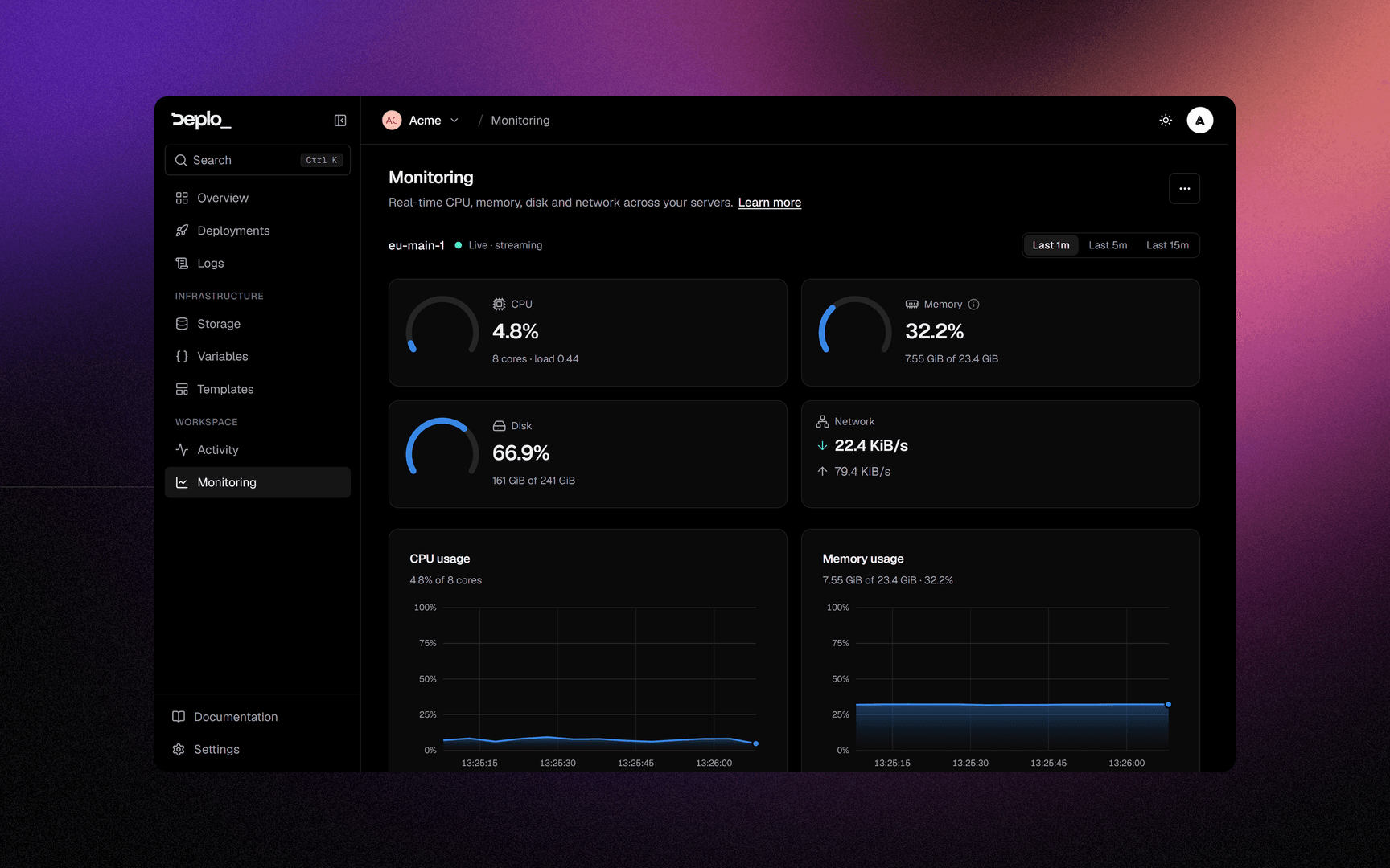
| Monitoring in the sidebar | Every server: CPU, memory, disk, network |
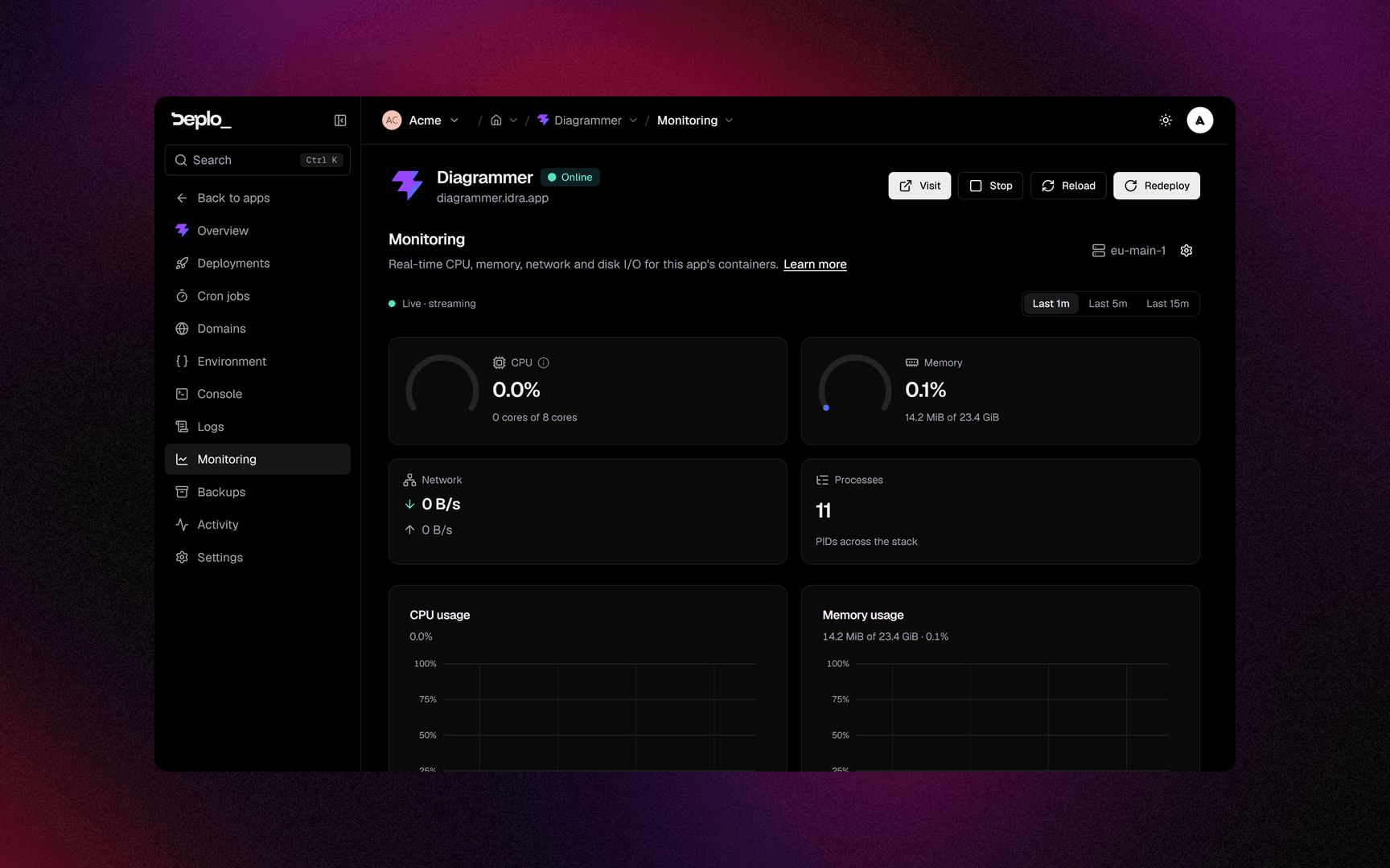
| An app's Monitoring tab | That app's containers, plus disk I/O, with the resource limits that apply |
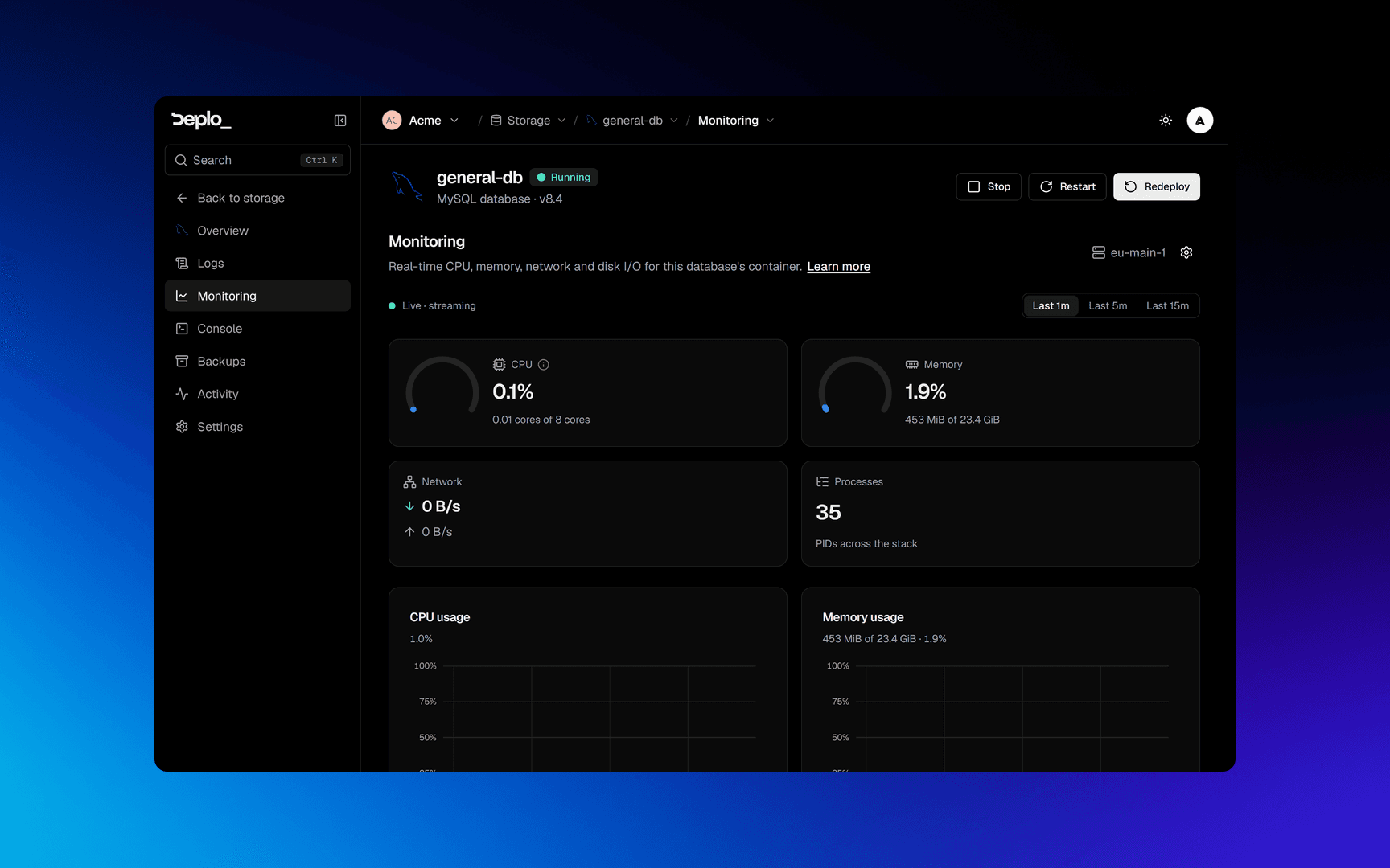
| A database's Monitoring tab | The same for the engine |
An app's or a database's Monitoring tab names the server it runs on in its header, with a Manage button for instance admins.
With more than one server, the Monitoring page shows one row per server with its CPU trend and three percentages. Click a row to show that server in the panels below, or use the searchable picker at the top. With a single server, the panels are the page.
The list is ordered worst first, by whichever of CPU, memory or disk is fullest. Past six servers it scrolls.
A row can also show Agent outdated when the server is behind the current
agent, and an info marker when it samples through docker stats, which costs
more CPU. Manage on each row opens that server's own page. It only appears
for instance admins.
Reading the numbers
Every figure matches what the same machine reports in a shell. Sizes are
binary (KiB, MiB, GiB), the units df, free, htop and docker use.
A server
| Reading | What it means |
|---|---|
| CPU | Percentage of the whole machine. Time spent waiting on a disk counts as idle, as in htop. |
| Memory | Total minus available, the used column of free. The tile's info marker splits it into processes and cache. |
| Disk | The filesystem holding the agent's data directory, as df reports it. |
| Network | Only the machine's real network interfaces. Docker bridges are left out to avoid counting bytes twice. |
| Load | The kernel's 1, 5 and 15 minute averages. |
Memory looks higher than in htop, and both are right. Deplo and free
count cache that cannot be reclaimed as used, while htop counts all of it as
free. The processes / cache split in the tile's tooltip is the difference.
CPU, memory and disk are drawn as arcs against the whole machine. The caption under each number says what the machine has. The arc turns amber past 80%.
An app or a database
| Reading | What it means |
|---|---|
| CPU | The arc fills against the resource limit when one is set, otherwise the whole machine. The caption names it (2.99 cores of 8 cores). The chart below uses the docker stats convention, a percentage of one core, so three busy cores read as 300%. |
| Memory | Measured against the machine's RAM, or against the resource limit when one is set. |
| Network | Counted once per network namespace. A sidecar sharing another container's network is marked network shared with <container> and counted once. |
| Disk I/O | Bytes read and written to disk by the stack's containers. |
| Status | Per container, in the breakdown table: the healthcheck result when the image defines one, otherwise the docker state (running, restarting, exited, paused, dead). |
| Restarts | How many times docker has restarted that container. Turns amber as soon as it is above zero. |
A container with network_mode: host is marked host network and adds nothing
to the app's network chart. Its traffic is on the server's chart instead.
Save metrics on server
One instance-wide switch, in the ⋯ menu at the top right of the
Monitoring page, on by default. Anyone with manage_monitoring can
change it.
Turning it off stops keeping history and clears what is stored. Live charts still work.
Alerts that come from metrics
The metrics stream also raises the server and app health alerts, delivered through notifications. See the Servers category there (server running hot, disk almost full, offline and back online, cannot run apps) and App keeps restarting in the Apps category.
Good to know
- History is in memory, not in the database. Restarting the control plane clears it.
- The fleet page needs whole-team access. A member limited to one folder sees an "outside your access" state.
- A gap in a chart means no data arrived, usually a reconnect. It does not mean the value was zero.
view_metricsis its own capability, labelled View monitoring in the picker, and can be granted per folder.
Troubleshooting
| Symptom | What to check |
|---|---|
| A server shows dashes, or its fleet row reads No data | The stream is not connected. Check that server's health. |
| A container's status is blank | That server's agent is too old to report one. An empty Status never means healthy. |
| A running container shows no healthcheck result | Neither its image nor the app defines one, so the status is running. Nothing is wrong. Add a health check if you want one. |
| An app shows nothing | It is stopped, or its containers are on a server whose agent is not reporting. |
| Charts are empty right after a restart | The history is in memory and starts again from zero. |
| A number does not match a shell | Check the unit first. Everything here is binary (GiB), and an app's CPU chart is a percentage of one core, not of the machine. |
More in Servers and agents.
Next steps
Did this page help you?